


Last Updated on February 22, 2024 by Nasir Hanif
We are the generation of the internet. We interact, communicate, play, learn and earn through the online platform. Tons of new businesses emerge and grow using the internet today. So, the first impression of the business depends on the kind of website they develop to introduce themselves. A gorgeous and professional website is the first significant step for the clients to recognize the brand. If the website isn’t up to the mark, it can blow out the company’s success. Learn to know about common web design mistakes
Innumerable articles with a great many tips & tricks are there to guide the designing of the perfect website. But along with the journey towards the best design, it is also crucial to get to know the errors that can occur. Fortunately, it is possible to avoid a lot of faults by being aware of them beforehand.
Listed below are the common website mistakes that come along the path to your dream website. Read on to find out how to improve your site’s SEO ranking and thus catch the eye of loads of clients.
Table of Contents
Trashy navigation
Have you ever come across a website where the information is placed in an annoying manner? Like everything you need to know is there but not properly organised and presented. What’s your first reaction? You’ll simply leave the website and look for your needs elsewhere.
The internet is full of options. And when people can have what they want in a jiffy, why would they waste their time? This is what you need to keep in mind. Your website must present the information in a way that your brand, your idea reaches the people quickly.
- The navigation menu must be easy to find. And should be clear and easily understandable.
- The placement of the navigation menu is also vital. Put it in the expected places like the header, footer or as a sidebar.
- The footer is essential. You can extend or even repeat the header so that the user can easily reach the required link.
- The side-bar must be well distinguished.
- All the links mentioned must direct the visitor to relevant web pages. No broken links allowed.
- Hyperlinks must be formatted to show an obvious difference from the rest of the elements. The design of your page must never puzzle the visitors. Usability must be given supreme importance.
- The navigation bar must be well organized. It shouldn’t have too many links and look clustered. Or shouldn’t be lacking links so that people can’t fully explore your website and brand.
- The colour of the already visited links should get changed so that visitors aren’t confused and end up visiting the same link again & again.
- Everything on the page must be simple, clearly organized.
Terrible CTA
CTA stands for a call to action. It instructs the visitor to find their way along with the website for better exploring it. Hence, CTA should have a significant amount of attention.
Commands like Click here!, Learn more, Read more, Get a discount etc are all part of CTA. CTA must be loud and clear to the visitors. A website defines a CTA to convert their visitors to a certain goal. For example, if they want more and more users to sign up, that is their CTA. A user has to certainly know about the results of a particular action on the website.
Always choose the simplest CTA. The user should easily get to know what is being provided to them and what amount of information they need to provide (if any). If there is any form-filling involved, the form must be uncomplicated and brief. Large forms increase the bounce rates and honestly, no one wants to fill 7 fields. If possible, enable auto fields too in the CTA forms. Also, the form must pop out at the right time i.e after the visitor has surveyed the website quite a bit. Annoying CTAs are never welcomed.


Unrelated or low-quality images
Everyone knows pictures are eye-catchy plus they can convey the message in short. Images deliver complex ideas in an easy peasy manner. That’s why when images are included in your webpage, your idea reaches the audience without needing them to read the whole page.
Because images have so much potential, they need to be added in the right manner. Blurry or fuzzy images kill the mood as they’re not understandable. Pictures low in quality end up giving out the wrong impression as they exhibit a lack of effort or skills. Similarly, irrelevant images that have no connection to the subject matter, make no sense. So, the images should be:
- Clear, nice and well placed.
- Authentic and professional.
- Should make sense.
- Summarise the message of your website in a concise, simple and appealing manner.
- Images should be original. Never use general stock photos as they’ll be confusing.
- You can use a story to demonstrate and answer any possible queries.
Also, keep in mind that your image is responsive in nature. A responsive image not only shrinks on a mobile screen but changes itself too!
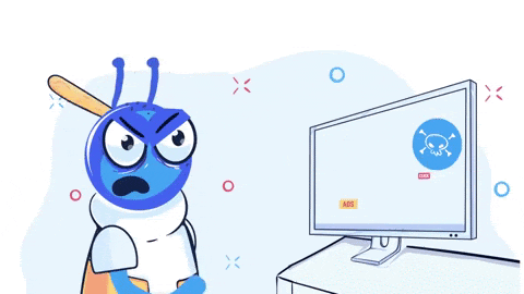
Ads getting in the way
Pop up ads are sinful yet useful. They are a mainstream income source on a majority of blogs. Hence, they can’t be avoided. However, when they show up suddenly and hinder the normal reading pace of the reader it is extremely annoying. These advertisements need to be managed.
For handling the pop-ups:
- Analyze all the ads keeping a user point of view. If the ad irritates you even the tiniest bit, you need to manage their placement.
- The ads must be smaller in size.
- The ads must be easy to close-up.
- Try to avoid any noisy or flashy ones. They are the worst kinds.
- Large numbers of ads will drive your visitors away. Regulate that.

Faulty content
Content is the king. The main focus is how well your website describes your brand. There shouldn’t be any plot-holes in the scripting of the website. To ensure the superior quality of the content on your site, the following steps should be followed:
- The content should never ignore the audience. Yes, you should elaborate on your business prospects and what an amazing job you can do and why you should be chosen etc, but the prime essence has to be the client’s desires and goals. When the content is designed as per the visitor’s perspective, it gives a good reputation and proves you to be reliable.
- Target only a specific kind of audience. Remember, you cannot please everyone. If you run after attracting too many types of customers, your website will end up looking jumbled and disarranged. Decorate the look & feel of the site according to only a small batch of the target audience.
- Arrange your subject matter in a way that makes it scannable. One glance and the visitor knows what the site is all about. Use expressive subheadings, present information pointwise & in small sentences, short and sweet paragraphs, and catchy formatting.
- Grammatical and spelling errors are totally unacceptable. They are blunders.
- Limit to one keyword per page. Too many products and services on a single page make it difficult to come on top of the Google searches, as the search engine gets confused what category your page belongs to.
- Content should be regularly updated.
No smartphone visibility
Smartphones have become the lifeline in today’s scenario. Therefore to reach as many customers as possible your website must be mobile-compatible. As more than half of the internet traffic comes through smartphones & tablets, if your site doesn’t have a mobile-friendly experience users will click off of it and look for some other source.
Your contact info is not there
How will the customer reach out to you if they want to give you a job? For that, you need to place your whereabouts on the website. It’s a must to have an illustrative ‘Contact us’ page that will act as your online business card. It should have your phone number(even multiple so that clients have more than one way to get to you), your email addresses, social media accounts (if any) and maybe your office address as well. And this ‘Contact us’ page must be clearly visible in the footer or as a sidebar.
By taking the above-mentioned mistakes and preventive measures into account, you are off to a good start in the website-making journey. Don’t forget to add tools such as LT Browser for testing your mobile-friendly website and LambdaTest for a simple and effective cross-browser testing. You can start your free trial today. LT Browser is the latest product of LambdaTest and has gained a loyal audience this is why it has been ranked the 5th top product by Product Hunt.
Blend the interests of your target audience and your business’s potential together and there you have it, a well-polished and highly professional website. Never forget to check your website properly for any shortcomings and improve your SEO ranking and in the process turn your visitors to your potential customers.
Enhancing Website Navigation for Better User Experience
Navigating a website should be a seamless experience, guiding users effortlessly to the information they seek. However, poor navigation can frustrate visitors and drive them away. Effective navigation design is crucial for ensuring that your brand and ideas reach your audience swiftly and clearly. Here are some key considerations to enhance your website’s navigation:
- Clear and Organized Menus: Ensure that your navigation menu is easy to find and understand. Organize it logically, placing it in expected locations like the header, footer, or sidebar. Avoid cluttering the menu with too many links, and ensure that each link directs visitors to relevant pages without any broken links.
- Distinctive Sidebar: If utilizing a sidebar for navigation, make sure it is well distinguished from other page elements. This helps users identify it quickly and navigate effortlessly.
- Footer Accessibility: Extend or replicate essential navigation links in the footer to provide users with easy access to key pages throughout your website.
- Responsive Design: Ensure that your navigation system is responsive across different devices, adapting seamlessly to various screen sizes. This guarantees a consistent user experience whether accessed on a desktop or mobile device.
- Visited Links Differentiation: Clearly differentiate visited links from unvisited ones to prevent confusion and help users navigate efficiently.
By prioritizing intuitive navigation design, you can create a user-friendly website that encourages exploration and engagement, ultimately enhancing your brand’s online presence and success.
Apart from this if you are interested to know about Your business need for a CRM in 2022 then visit our Technology category.


