Last Updated on February 16, 2022 by
Have you ever walked into a room and felt your mood change? That is color theory interior design in action. Using combinations of colors can help you achieve the exact ambiance you want in a room and color theory is the key to unlocking it all.
If you’re an interior designer or a DIY fundi, keep reading for a quick overview of how to use color theory for decorating.
Table of Contents
Understanding Color Theory in Interior Design
Color influences human psychology and we use this fact to layer-specific tones in each room of our homes. Lighter colors create a calm, spacious feeling, while darker colors make a bold statement and feel warmer. Your goal for each space can be your starting point.
In a study, for example, you may want to use a vibrant palette that wakes up the senses and gets you in work mode. You may want to dress a bedroom in cozy colors that are perfect for cuddling up with a good book, while a light, airy kitchen clears your mind while you plan the week’s meals.
Color Wheel Basics
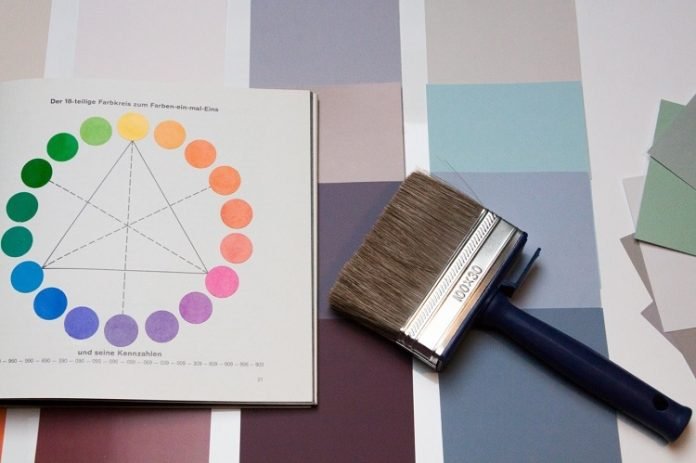
There’s more to using color in a space than picking out the swatches that catch your eye at the local paint shop. Color theory is a set of guidelines to make it easier for designers to know how to choose and match colors to create a visual landscape. It is the art of combining colors and it starts with the humble color wheel.
The first layer of the color wheel is made up of the three primary colors (red, blue, and yellow). These are colors that can’t be created by blending other colors. The second layer is made up of the colors you get by mixing secondary colors (purple, green, and orange) and are called complementary colors. Mixing the complementary colors gives you six colors, known as the tertiary colors.
Splitting the color wheel down the middle gives you warm colors on one half and cool colors on the other.
Hues, Shades, Tints, and Tones
Hue is the pure color on a color wheel without any changes. Adding black to a color creates a shade of that color. Anytime you add white to a color, you get a tint. Tone is created with you add grey.
Shading, tinting, and toning the twelve basic hues provides you with a multicolor world of design choices that can be overwhelming. However, designers have a secret weapon they use to make color choices that makes it all simple – color schemes.
Color Schemes In Design
Logical color combinations are called color schemes and they are your best design friend. A color scheme provides a simple way to find the right combination of colors for the look you want to achieve. Here are some examples of color schemes:
Monochromatic:
For a simple, fresh look, opt for a monochromatic color scheme. This effortless look takes tones from the same hue.
Analogous:
This color scheme uses a range of colors as they are found next to each other on the color wheel. Think of the graduated, flowing colors of an ombre.
Triadic:
Pick three hues that are spaced out equal distances from each other on the color wheel.
Square:
Pick four colors that are evenly spaced on the color wheel. A square color scheme will always be made up of a primary color, a secondary color, and two tertiary colors.
Tips for Using Color Theory in Interior Design
Colors set the tone of a room and can influence emotions and moods. Introducing warm colors into a living space evokes warmth and passion. Cooler tones are refreshing and relaxing.
When you’re faced with the blank canvas of an empty room, and a commercial painting contractor lined up to come in to make the magic happen, where do you start the design process? Here are some ideas to use as design inspiration sparks:
Build a Color Scheme Around the Biggest Element in the Room
Look at the elements that are already fixtures in the room. Perhaps there are pale sapphire mosaic tiles inlaid around the fireplace or a decorative panel of deep gray stone inset in the wall. There may be a colorful light fitting that creates an ambiance in the room that you’d like to preserve.
Look for any existing splash of color that you can use as a starting point, then build your design around that.
Go Ombre – Dark to Light
Working vertically, start with dark down low and work your way up getting gradually lighter. Practically, this means using dark colors for the floors, medium shades on the walls, and a light ceiling. Your furniture and finishes pick up on the different shades according to what looks right. This is a good way to make a room look larger.
Neutrals and Naturals
Opting for a neutral base is a fantastic way of using color. With a neutral base, you are free to bring in accent colors and elements to create the exact feel you want. The best part of having neutrals as a base is how easy it is to dress up the room in different shades of soft furnishing and accessories. You get to change the mood without having to invest in a complete room overhaul. Neutrals offer a clean, fresh pallet that can be transformed by layers of color.
Color Theory in Interior Design Equals Gorgeous Results
Using color theory to design your interiors will give swoon-worthy results. Applying simple principles will not only make your color decisions easier but will produce the results you’re looking for. Embrace color theory and give your home the makeover it’s been waiting for!
If you enjoyed this article, find other useful home upgrade tips under our Home Improvement tab.
Read more: Home Decor: 5 Interior Design Tips for Homeowners


