Last Updated on January 14, 2023 by Faiza Murtaza
As a business owner, knowing the current trends in design is essential, even if you are not a designer. The more you know, the better your design will be.
This is because even if you might not be able to do the actual design work, it will be easier to recognize a well-done piece.
Are you looking for design trends you can use to dazzle your audience? The duotone effect is so enticing. But what is the duotone effect, and how can you incorporate it into your design work? Let’s delve into it.
Table of Contents
What is the Duotone Effect?
The word duotone is derived from the fact the designs are created using two colors. The duotone effect is a design trend that utilizes two contrasting colors to generate a dramatic and aesthetically pleasant impact.
The duotone effect became popular while photography was still in its infancy. It was used to enhance grayscale images in sepia photos.
It was also commonly used for music covers and movie posters in the 1960s and 1970s to save money on paint. Artists were able to generate a psychedelic impression with their work by employing clashing hues.
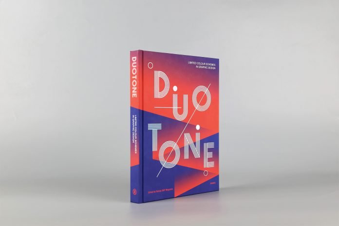
Surprisingly, the duotone effect is still a trend in the present day. With the advancement in technology, it has become significantly more adaptable as it can be used on posters, infographics, book covers, images, custom product pouches, and interfaces. It helps both large and small businesses differentiate themselves from the competition.
Spotify and Adidas are examples of established brands that use the duotone effect.
How to Create Appealing Duotone Designs
Whether you are publishing a book, an interface, designing a website, or packaging, knowing about duotone is crucial.
The duotone effect could be the difference between creating a flat unappealing design and standing above your competition.
Follow the steps below to create an attractive duotone image.
STEP 1: Consider your choice of colors.
The fact that the duotone design confines you to two hues doesn’t mean that you should select the colors randomly. You only have two colors to work with, so make them count.
Make sure that the two colors work together. This is where your design sense comes into play.
Determine which colors go well with each and which ones don’t. For example, mixing fuchsia with purple is unlikely to pique interest.
STEP 2: Use contrasting color shades.
Another technique to help you obtain a more dynamic look with your color choices is to employ dual tones of contrast colors.
It also gives your photos a more distinct and polished appearance.
STEP 3: Play with colors.
Don’t be afraid to take risks and try new things. Earlier on, we said that you should be conscious of the colors you use.
However, that doesn’t mean being boring; try experimenting with other color schemes.
Think about the message you want to send through your images, then pick the most appropriate color combination.
STEP 4: Convert your image to grayscale.
To ensure that your image goes well with the chosen colors, convert it to grayscale. This will make spotting and highlighting the color contrast much easier.
It is just as crucial to have a strong contrast between your graphics’ dark and light areas.
STEP 5: Use many design mediums.
Don’t limit yourself to a single form of expression. Despite the fact that pictures were the first media to exploit the duotone effect, don’t restrict yourself to them.
To spice up your design, including illustrations and other graphics. Your work will be more multidimensional if you employ a variety of artistic materials.
Try Duotone For Your Branding and Marketing Designs
The duotone effect, though modest, is an effective design technique that may be utilized to brighten up a drab image.
The beauty of the design lies in its simplicity. You don’t need a slew of photos to create an impression on your audience. You also don’t have to go crazy with the drawings.
The use of color contrast to make your photographs more appealing and grab your audience’s imagination is a fundamental part of the duotone effect.
Read More: Effect Of Automation On The Job Market


